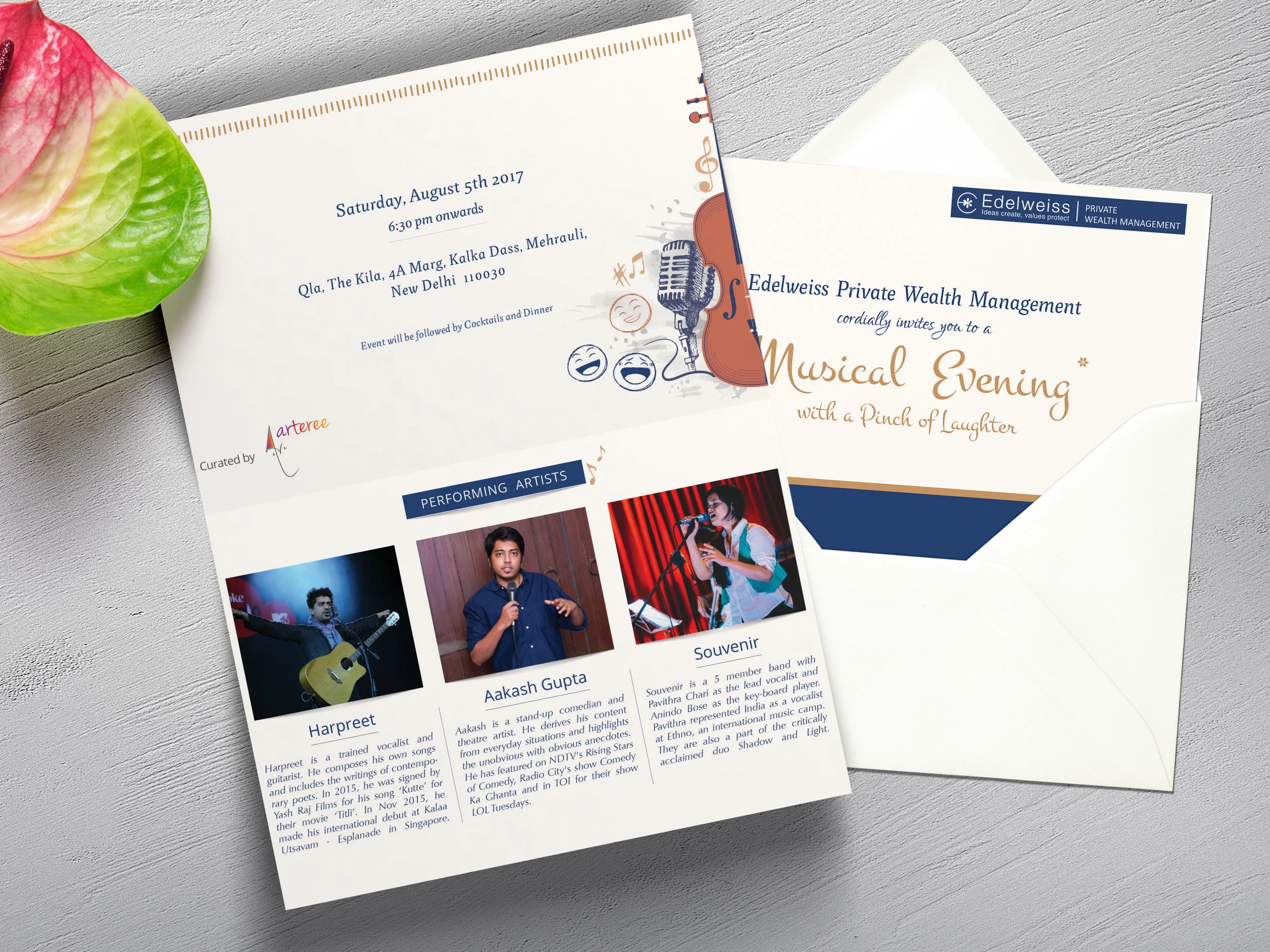
My design proposal was inspired by the recreational nature of this event which I wanted to address in a simple yet informative fashion. I created an attractive layout that brought the focus to the fore through a playful typeface using a select colour palette. Blue is integral to Edelweiss’ brand identity which I teamed with hints of gold and copper to represent celebration.
The generic illustration and use of textured paper in the physical invite were included consciously to enhance the appearance of the layout. The idea was to make it warm and inviting across both print and digital formats.